Kitchen Color Ideas: 29 Fresh Palettes You’ll Love
Walk into a kitchen with the right color and your shoulders drop. Kitchen color ideas can do that, and the best ones start with one simple choice, not a full renovation.
Maybe you are staring at plain white walls or a paint sample that looked nothing like it did in the store. I’ve been there and I’ve noticed that most beginners freeze because there are too many options. This article fixes that. You will find a wide range of palettes, from soft sage and warm cream to bold navy and plum, each with simple tips on pairing, finishes and lighting. Some ideas need only a weekend and a can of paint. Others are small swaps, like new pulls or a painted island. I’ve seen many people benefit from testing one shade before committing, so I’ll show you how. Scroll slowly, save your favorites and let your kitchen start feeling like yours.
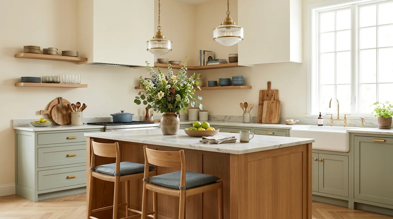
Sage Green Walls

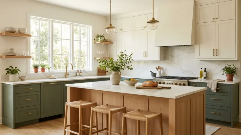
Sage green is the shade that makes people exhale the moment they walk in. It sits between gray and green, so it feels fresh without shouting. I’ve noticed it looks softer than most greens in morning light, especially on walls that get an east-facing sun.
Pair it with white cabinets and warm wood to keep the room balanced. Brass or black hardware adds contrast. Paint a small test patch and check it at noon and at night, because sage can drift toward gray under cool bulbs. Choose a matte or eggshell finish for forgiving walls.
Navy Blue Cabinets
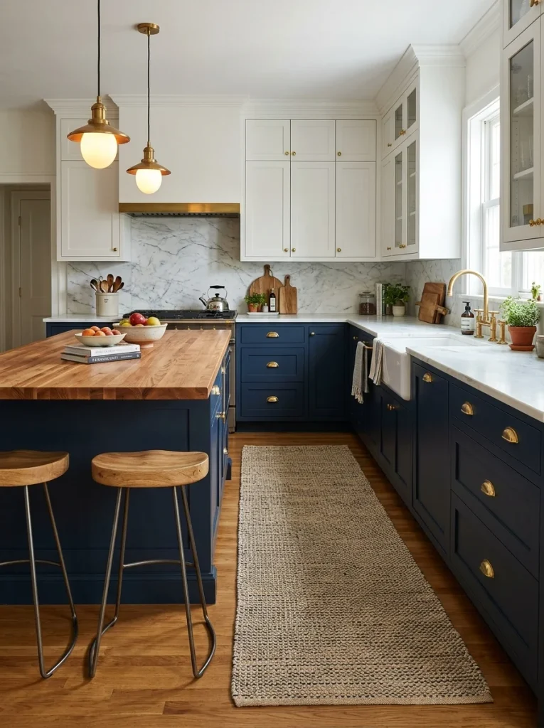
- Navy gives a kitchen instant depth, so start with the lower cabinets and keep the uppers white.
- Choose a satin finish, since it wipes clean easily and hides fingerprints better than gloss.
- Match brass or brushed gold pulls with the navy for a classic, warm contrast.
- Light countertops like white quartz stop the room from feeling heavy.
- Use a warm 2700K bulb so the blue does not turn cold at night.
In my experience, navy works best in kitchens with at least one decent window. Small, dark rooms can feel closed in. I’ve seen it look stunning in medium kitchens where natural light bounces off white walls. Test a sample on one door before committing to the whole run.
Butter Yellow Accents
Quick Tip:
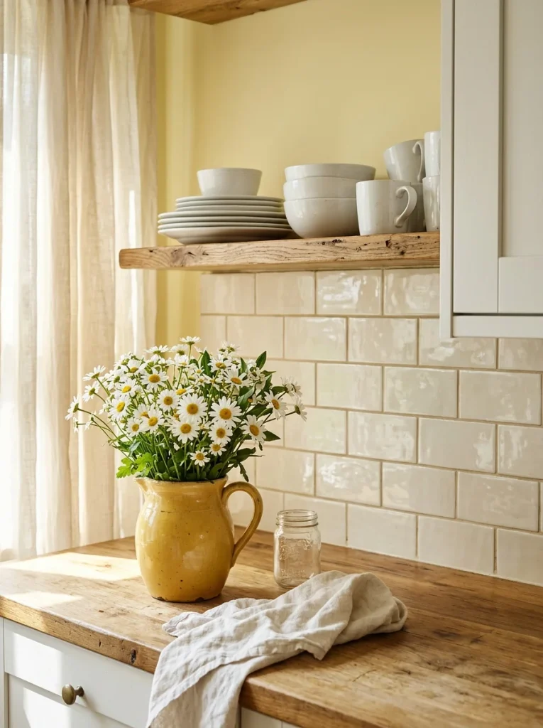
Pick a butter yellow with a touch of cream, not lemon. Lemony shades turn harsh under LED bulbs. Hold a paint card against your white cabinets to check they look soft together.
Yellow is the fastest way to make a kitchen feel awake before coffee. Butter tones glow in low light and flatter wood floors. For a fresh take on kitchen color ideas, keep the shade on one wall and let white do the rest. Small doses read cozy, never loud.
Read More: Living Room Makeover Ideas: 28 Jaw-Dropping Changes
Warm Terracotta Tones
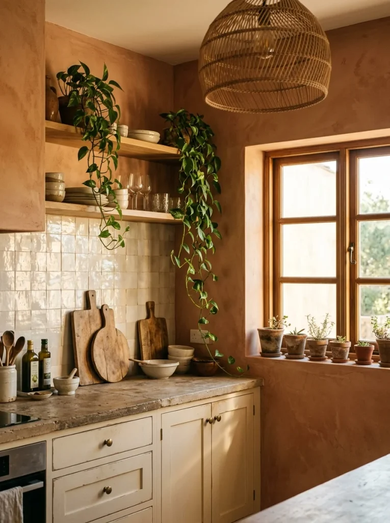
Before: A plain beige kitchen can feel like a waiting room. White trim, tan walls and no real color story leave the space flat all day.
After: Paint the walls a soft terracotta and the room feels sunlit, even on cloudy days. Cream cabinets keep it light, while wood and rattan add warmth.
Terracotta works because it borrows warmth from clay, brick, and sunsets. Choose a muted, slightly dusty version, since bright orange reads loud in small rooms. I’ve seen it soften stark white kitchens beautifully. Sample two shades near your window and judge them after dinner, when lamps change everything.
Charcoal Matte Cabinets

- Scrub every door with a degreaser, because kitchen grease blocks paint and nobody sees it until it peels.
- Sand lightly with 220 grit paper, then apply a bonding primer.
- Roll two thin coats of matte cabinet paint, letting each coat dry fully.
- Add black or warm brass pulls, then check the color at night.
Charcoal gives kitchens a tailored, grown up look without feeling cold. I’ve noticed it hides splashes and fingerprints better than white. Keep counters and walls light so the cabinets become the star. Matte paint can scuff, so wipe it gently every week with a soft damp cloth.
Soft Blush Pink

| Point | Bright Pink | Muted Blush |
|---|---|---|
| Mood | Playful and loud | Calm and soft |
| Pairs with | Black accents | Gold and white |
| Small kitchens | Feels crowded | Feels open |
| Lasting appeal | Trendy | Timeless |
Pink in a kitchen sounds risky, but the right shade reads like warm plaster, not candy. Look for blush with a bit of beige in it. Pair it with white trim and gold or brass fixtures. I’ve seen it make small kitchens feel brighter and kinder at breakfast.
Two-Tone Cabinets

Do:
- Keep the darker shade on the lower cabinets to ground the room.
- Repeat one cabinet color in a rug, stool, or towel.
- Use the same hardware finish on both colors.
- Choose two shades from the same undertone family.
Don’t:
- Never split the colors evenly across every wall.
- Never mix more than two cabinet shades.
- Never pair two bold colors that compete.
- Never skip testing both paints side by side.
Two colors can make a plain kitchen look custom built. The trick is weight. Dark colors feel heavy, so keep them low and let light shades float above. I’ve noticed the result looks intentional even in rentals with basic cabinets. Always check both colors together under the bulbs you actually use.
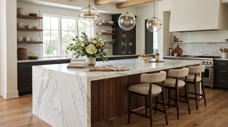
Cream and Walnut
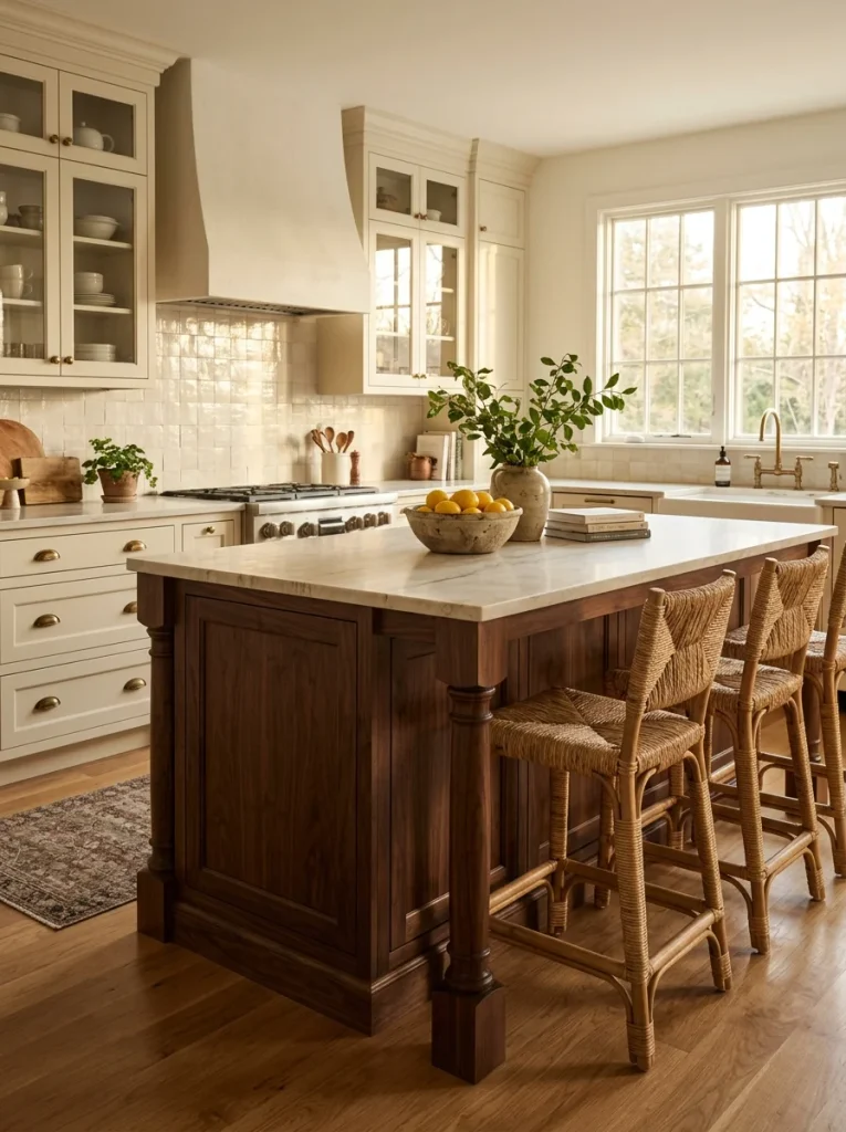
Cost: Medium | Time: Two days for paint
Best For: Traditional and transitional homes
Skill Level: Beginner
Result: Warm, timeless, easy to live with
Cream and walnut feels like a hug in kitchen form. The pale tone keeps things bright, while dark wood adds richness and depth. If real walnut is pricey, a walnut stained island or wood look floors give the same warmth. Pick a creamy white with yellow undertones, not stark white.
Forest Green Cabinets

Forest green gives a kitchen the calm of a quiet woodland path. It feels rich without being flashy, and it ages well, which is why many experts recommend it. Deep tones also hide scuffs. Marble, brass, and warm white walls let it shine all day long.
Keep the room bright by choosing light counters and a pale floor. Pick a green with a hint of black, since pure bright green feels playful instead of grounded. Satin paint cleans easily with a damp cloth. Test the shade next to your countertop sample before you buy gallons.
Warm White Walls

- Pick a white with a drop of yellow or beige, because pure white can look icy in winter light.
- Paint the ceiling and trim in the same white to make small rooms feel taller.
- Choose eggshell on walls so scrubbing marks stay hidden.
- Layer texture with baskets, linen and wood so the room never feels flat.
White kitchens never really left, but warm whites feel friendlier than the stark kind. They bounce light into dark corners and make cabinets look fresh. I’ve painted a gloomy galley kitchen this way and the whole room felt wider overnight. Bring in color through art, plants and dishes.
Powder Blue Backsplash

Quick Tip:
Order a few tile samples and tape them behind your stove for two days. Glossy blue changes color with the light, so you want to see it morning and night. Skip any shade that looks gray at dusk.
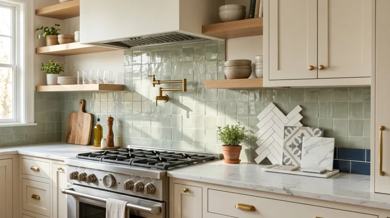
A backsplash is the easiest place to try color because it is small, affordable, and the wall people look at most. Powder blue feels clean and calm next to white cabinets. Peel and stick tile works for renters. Finish with white grout for a crisp, bright line.
Olive Green Island

Before: An all white kitchen can feel like a showroom nobody lives in. The island blends into the cabinets and the room loses its center. Everything looks tidy but a little flat.
After: Paint just the island olive and the eye lands there first. The space gains a focal point, and the white cabinets look crisper. It feels collected, not crowded.
Islands are the safest spot for a bold shade because you can repaint one piece in a weekend. Olive has a soft, earthy depth that works with wood stools and brass lights. Choose a satin finish for easy wipe-downs and match the island paint to a small accent nearby.
Greige Neutral Walls
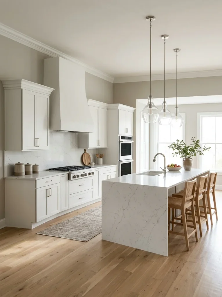
- Hold three greige samples against your counters and floor, since undertones decide everything.
- Choose the sample that looks beige in shade and gray in direct sun.
- Paint a two foot square and watch it for a full day.
- Roll two coats in eggshell and keep the trim a clean white.
Greige is the paint color that quietly works almost everywhere. It hides smudges and lets food, plants, and dishes bring the color. I’ve noticed the best ones lean slightly warm. Skip anything with a purple tint, since it can show up under LED lighting.
Black and White Contrast

| Point | Black Accents | Black Cabinets |
|---|---|---|
| Mood | Light and crisp | Dramatic and bold |
| Cost | Low | Higher |
| Needs | Hardware, lights, faucet | Paint or new doors |
| Best light | Any | Plenty of daylight |
Black and white never feels dated because the contrast is so clear. Start with black accents, then add more if you love it. Black faucets and pulls can change a kitchen more than a full repaint. Keep one warm element, like wood or brass, so the room stays friendly.
Coral Orange Pop

Do:
- Limit coral to one wall or one big piece.
- Balance it with white, cream and natural wood.
- Choose a slightly muted coral that leans peachy.
- Repeat the shade once in a small accessory.
Don’t:
- Never paint every wall and the cabinets coral.
- Never pair it with other bright colors.
- Never use glossy paint across large walls.
- Never skip a sample, since coral shifts with light.
Energy is the whole point of coral. It wakes up a morning kitchen and makes a small room feel social. Keep it to a single moment and let neutrals do the rest. For renters, a coral rug, towels and stools give the same lift without touching paint.
Slate Gray Counters

Cost: Medium to high | Time: One to two days for install
Best For: Busy cooks who want low maintenance
Works In: Kitchens with white or light wood cabinets
Difficulty: Hire a pro for the install
Counters cover a lot of visual space, so their color sets the mood. Slate gray hides crumbs and water spots better than white. It also looks great with warm wood. Ask for a honed finish, since polished stone shows every fingerprint. Always view a full slab, not just a tiny sample.
Seafoam Coastal Look
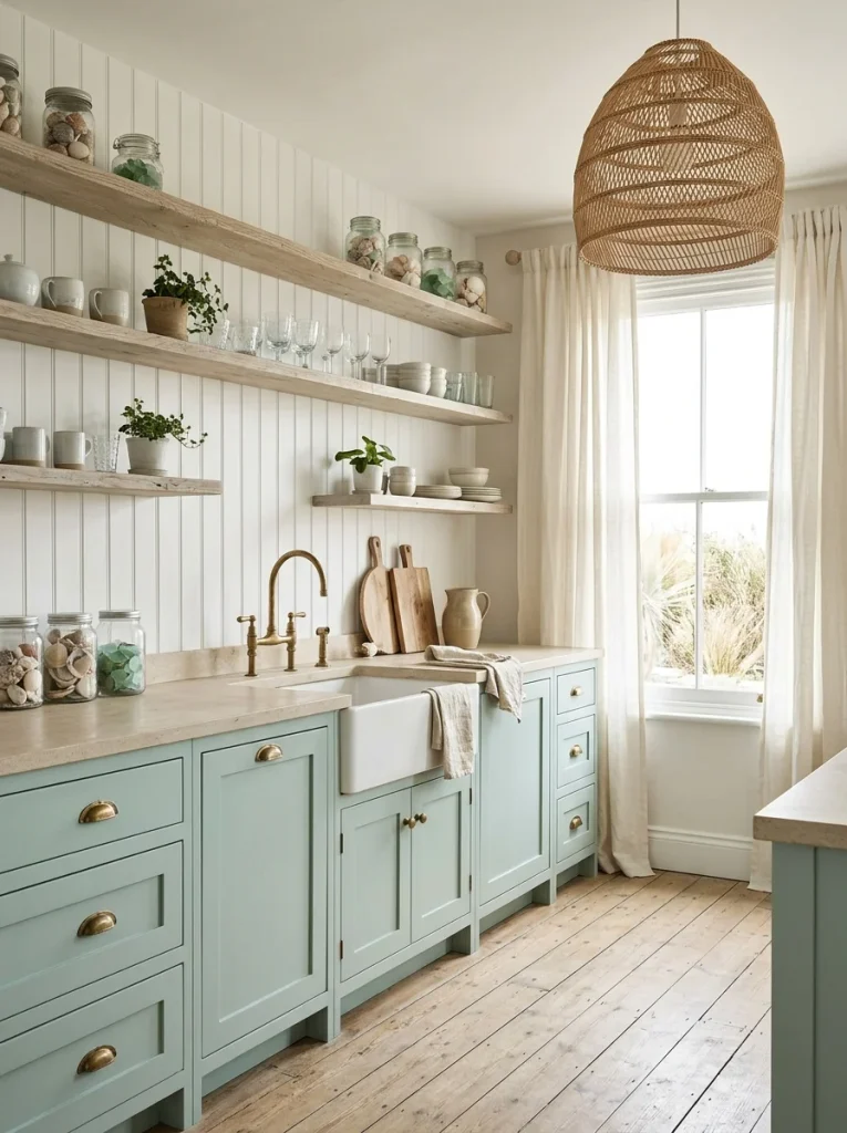
Seafoam brings a vacation feeling home, even if the nearest beach is hours away. The shade is soft, watery, and a little bit vintage. It looks best with white beadboard, pale woo, and sandy neutrals. Avoid heavy dark counters, which can pull the lightness down.
Pick a seafoam with a drop of gray so it feels sophisticated, not minty. In my experience, small kitchens with lots of daylight carry this color best. Add natural textures like rattan, jute, and linen to keep it grounded and cozy. Test the sample beside your window first.
Deep Burgundy Cabinets

- Choose a burgundy with brown in it, since pure red can feel too intense.
- Gold or aged brass pulls make the color glow.
- Cream or stone counters keep the contrast soft and classic.
- Soft warm bulbs bring out the depth at night.
Burgundy sounds bold, yet it behaves like a neutral once it is on cabinets. It pairs easily with wood, cream, and green plants. That’s why many experts recommend it for kitchens that need warmth. Start with a lower run or an island if a full set feels like too much.
Lavender Gray Walls

Quick Tip:
Choose a lavender that leans gray, not pink. Pink toned versions can turn bubblegum in warm light. Check it beside your countertop, since marble with gray veins loves this shade.
Lavender gray is a quiet surprise. From a distance it reads as a soft neutral, then up close you notice the gentle color. It calms busy kitchens and flatters white cabinets. I’ve noticed it looks best with silver or nickel hardware. Pair it with greenery for a fresh, spa like feel.
Retro Mint Cabinets
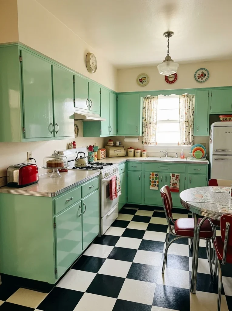
Before: Plain beige cabinets can make an older kitchen feel tired. The room has charm in its shape but none in its color. Nothing invites you to linger.
After: Mint cabinets turn the same layout into a cheerful retro corner. Chrome pulls, a checkerboard floor, and cream walls finish the story. Suddenly breakfast feels like a small event.
Retro does not have to mean costume. Choose a softer mint with a bit of gray, then keep the rest of the room simple. Cream walls and warm wood stop it from looking like a theme park. Use semi gloss paint so sticky fingers wipe off in seconds.
Natural Wood Warmth
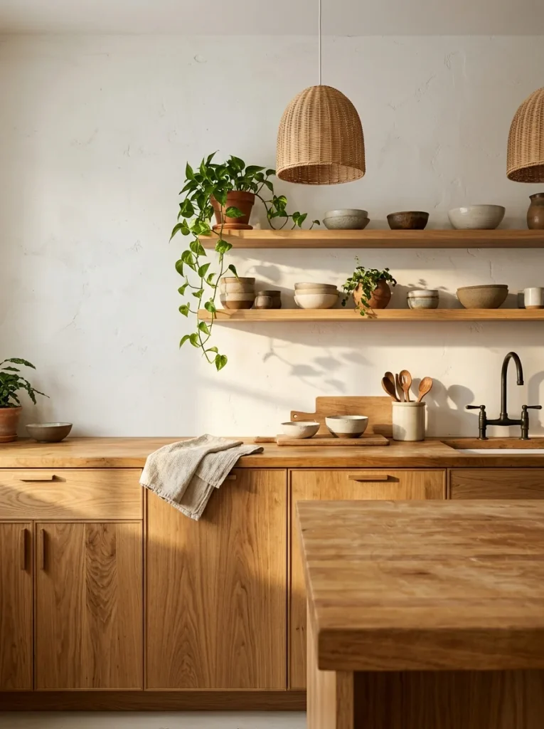
- Match undertones first, since honey, red and gray woods clash when mixed carelessly.
- Choose one dominant wood and repeat it in two places.
- Break it up with white or cream walls so the wood can breathe.
- Add one contrasting piece, like a black stool or dark frame.
- Seal raw wood with a water based finish to protect it from splashes.
Wood is a color too, and it is the easiest one to live with. It brings warmth that paint cannot copy. I’ve found that two wood tones work well if one is clearly lighter. Keep metals simple, and let texture do the decorating. Oil butcher block twice a year to keep the grain glowing.
Soft Taupe Cabinets
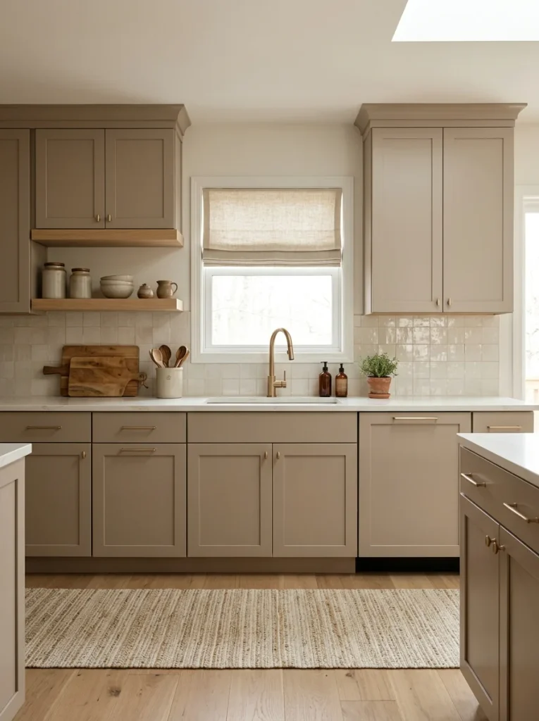
| Point | All White | Soft Taupe |
|---|---|---|
| Smudges | Show quickly | Hide well |
| Mood | Bright and sharp | Warm and grounded |
| Pairs with | Almost anything | Wood, brass, cream |
| Depth | Flat | Layered |
White cabinets are popular for a reason, but taupe adds a layer of depth that feels more personal. It sits between gray and brown, so it works with both cool and warm finishes. That is why it shows up in so many resale homes. Choose a mid tone, not a very pale one.
Teal Statement Island
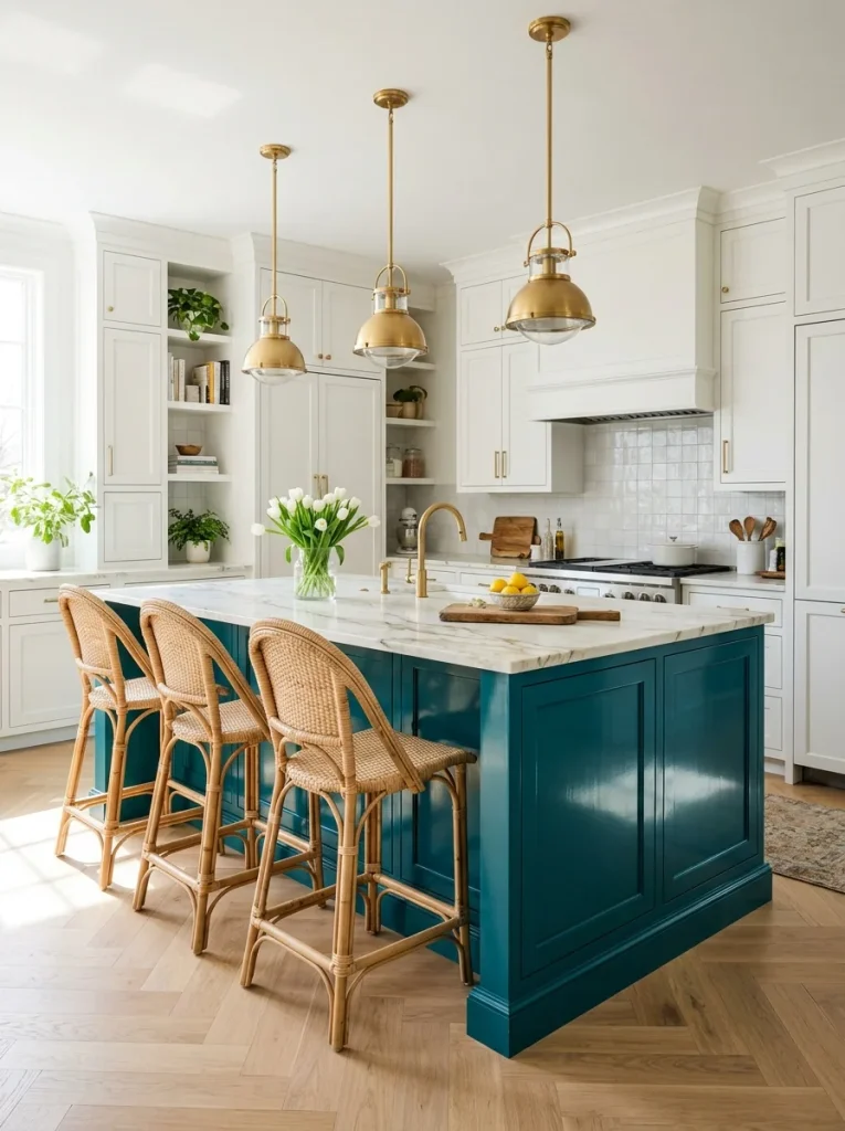
Do:
- Choose a teal with gray in it for a richer, calmer look.
- Pair it with white, gold, and natural wood.
- Use satin or semi gloss for a durable finish.
- Hang lights with warm bulbs to make the color glow.
Don’t:
- Never match the walls to the island.
- Never add more than one other bold color.
- Never use cool white bulbs, which dull the blue.
- Never skip sanding and priming.
A teal island is a jewel in the middle of the room. It anchors open plans and adds personality without touching the walls. I’ve seen it make a plain white kitchen feel designed. Echo the shade in a tiny accent, like a bowl or tea towel, so it feels planned.
Peach Cream Glow
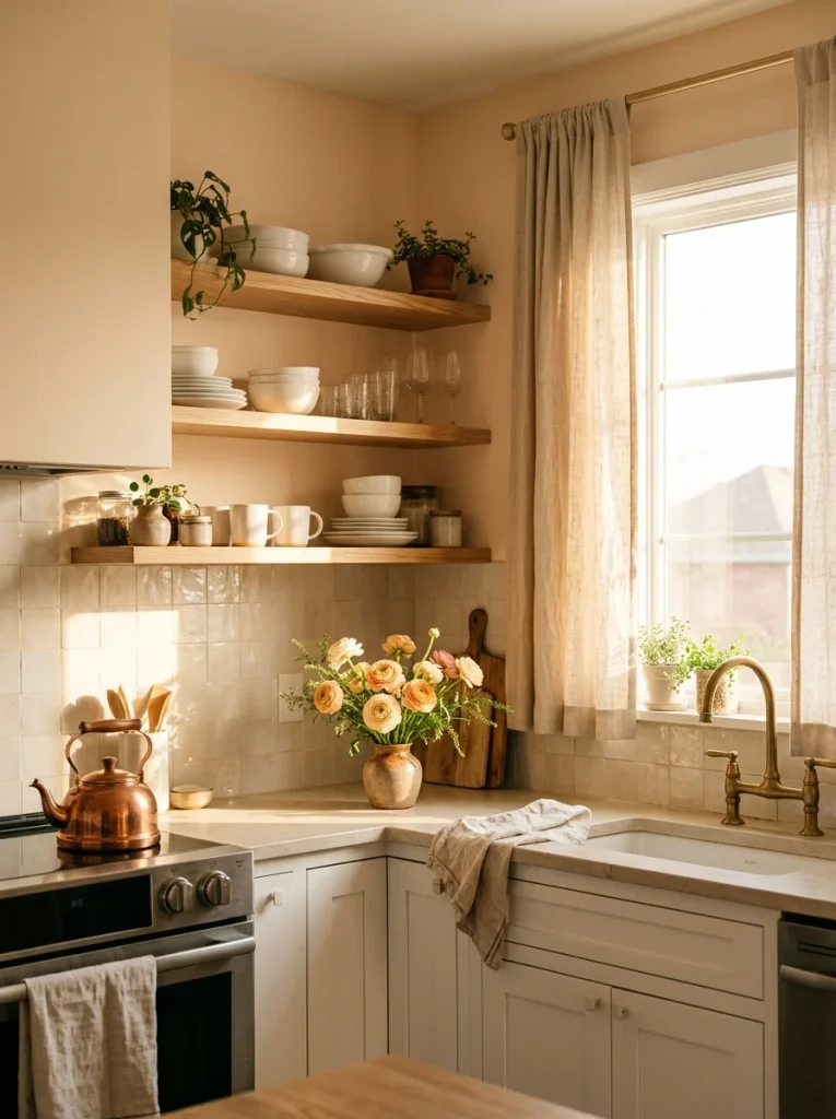
Cost: Low | Time: One weekend
Skill Level: Beginner
Best For: Kitchens with little natural light
Result: A soft, sunny glow all day
Peach cream is the shade that makes a north facing kitchen feel sunlit. It reflects warmth back into the room, even on gray mornings. Choose a version with more cream than orange so it stays subtle. White trim and pale wood keep it fresh. I’d test it on two walls before committing.
Gray Blue Walls

Gray blue is the color of a calm morning sky. It adds a little personality while staying soft enough for daily life. In my experience it is easier to live with than navy, because it does not swallow light. White cabinets and nickel hardware keep it crisp.
Pick a shade with a bit of green in it if your kitchen faces north, since cooler light can push blue toward icy. South facing rooms can handle a clearer blue. Paint a large sample and watch it from the doorway at three times of day.
Copper Metal Accents
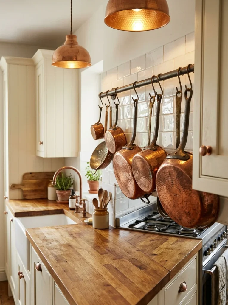
- Start with something small, like a pot rack or a set of cabinet pulls.
- Pair copper with cream, deep green or navy so it stands out.
- Keep the finish consistent, since mixing bright and aged copper looks messy.
- Limit metals to two types so the room feels calm.
Copper behaves like a color, even though it is a metal. It adds a rosy glow that warms white walls without paint. I’ve tried copper pendants over islands and loved how they glow at night. Polish cookware gently and expect a natural patina on unsealed pieces over time.
Pearl White Monochrome
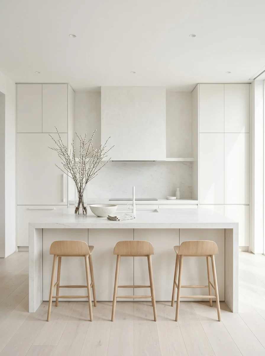
Quick Tip:
Layer three different whites, such as warm cream walls, soft pearl cabinets, and bright white tile. The slight shifts keep the room from feeling flat. Add texture with wood, linen and woven baskets.
A monochrome kitchen is peaceful and it makes small spaces look larger. The secret is texture, not color. Mix matte walls with satin cabinets and rough stone. This style works best when counters stay mostly clear. One bowl of lemons gives you the only color you need.
Deep Plum Accents
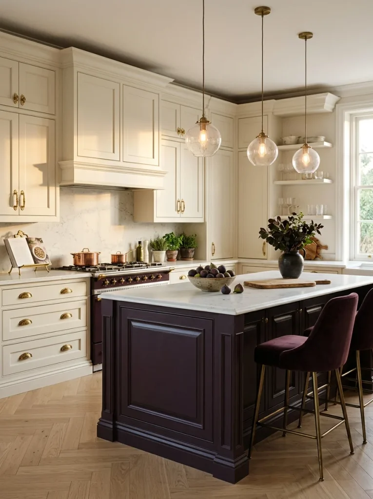
Before: A cream kitchen with brass pulls can look polite and a bit forgettable. Everything matches, but nothing surprises you. The room waits for a spark.
After: Add plum on the island or a single wall and the room gains depth. The cream looks richer, and the gold glows warmer. Guests notice it first.
Plum is bolder than most people expect, yet it feels grown up. Think small first: a stool cushion, a painted island, or a vase. In my experience, a muted plum with brown undertones works better than a bright purple. Pair it with cream, gold and wood.
Colorful Tile Backsplash
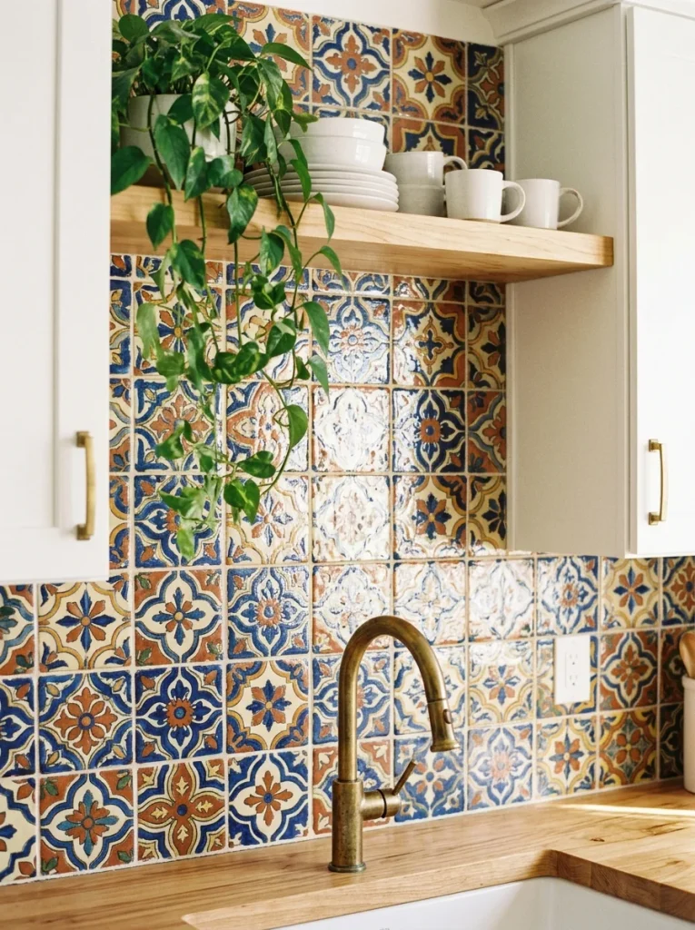
- Choose one pattern that includes two or three colors already in your kitchen.
- Keep cabinets and walls simple, like white or cream, so the tile leads.
- Place the pattern in one zone, such as behind the stove.
- Match grout to the lightest tile color for a clean look.
- Seal the grout so splashes wipe away easily.
Color does not have to cover every surface to make a statement. Among all the kitchen color ideas I have tried, a patterned backsplash is the easiest to love every day. It gives you a full palette in one place. Pull one shade out for towels and plants.
Conclusion
A kitchen does not need a full remodel to feel new. One fresh color, one painted island or one bold tile can shift the whole mood of the room. I’ve seen how small changes like these can completely change the way a space feels. Pick the kitchen color ideas that match your light and your life, then test them slowly. Save this post on Pinterest so your favorites are easy to find later. Try one idea this weekend and share the article with a friend who is stuck on paint. Your best kitchen is closer than you think.


One Comment