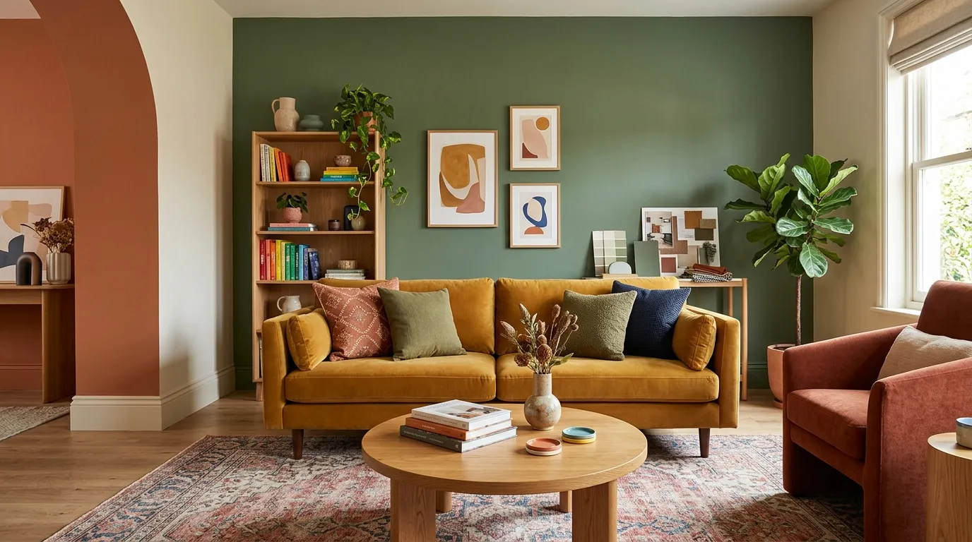
Living Room Color Ideas: 29 Palettes That Feel Timeless
Choosing paint can feel like a high stakes guess. You stand in the store holding twenty swatches that all look the same and nothing tells you how they will look at home.
These living room color ideas take the guesswork out. Inside, you will find 29 timeless palettes, from soft greige and sage to moody forest green and warm white with wood. Each one shows you the mood, the best pairings and the small details that make the color work.
I’ve seen many people repaint twice because they trusted a tiny chip under store lighting. In my experience, a good palette plus a large sample on your own wall saves money and stress. Scroll, save your favorites and find the one that feels like home.
Greige Neutrals

Greige is the color that makes people stop repainting. It sits between gray and beige, so it never feels cold or yellow. That makes it one of the safest living room color ideas for first time painters. In my experience, it also hides scuffs better than pure white.
Pair it with crisp white trim and warm oak or walnut furniture. Add cream linen curtains and a wool rug to keep the room soft. Test two samples on different walls first, because greige shifts with daylight and can lean pink or green by evening.
Soft Sage Green
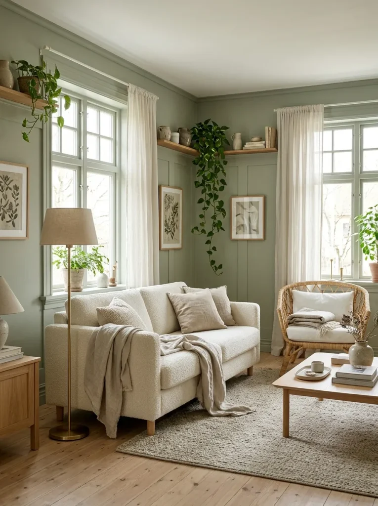
- Sage is the green that feels like a deep breath. It reads calm instead of loud.
- Choose a gray leaning sage if your room faces north, since it keeps the green from looking muddy.
- Pair it with ivory, warm white and light oak for a soft, natural contrast.
- Brass lamps and black picture frames give the walls a little definition.
- Small rooms handle this shade well, since the color never feels heavy.
Sage works because it comes straight from nature, so plants, wood and linen all sit comfortably beside it. Expect a quieter, more relaxed room. Choose a matte finish, which hides wall flaws and gives the color a soft, chalky depth. Best for living rooms that get plenty of daylight.
Navy and Cream
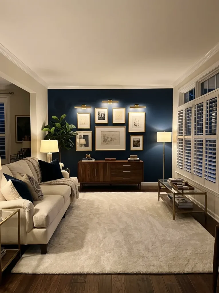
Quick Tip:
Paint just one wall navy, ideally the one behind the sofa and keep the other three cream. A full navy room can feel heavy without strong daylight. Add two table lamps so the corners keep glowing at night.
Navy gives a living room instant depth, while cream keeps it from turning moody. The contrast looks tailored and calm at the same time. Guests tend to notice this pairing right away. Layer in walnut wood and brass accents and the room feels warm and grown up.
Read More: Living Room Layout Ideas: 25 Foolproof Arrangements
Terracotta Walls

BEFORE: White walls and gray furniture can leave a living room feeling flat and a little chilly. The space has no warmth, so people sit down but never really settle in.
AFTER: Clay toned walls wrap the room in a sunset glow that makes evenings feel slower. Cream and wood pieces suddenly look richer against the color.
Terracotta works because it is a natural earth tone, so it pairs easily with linen, jute and aged wood. It looks best in a matte finish with warm white trim. Start with a soft, sandy terracotta, then deepen the shade only if you love it.
Charcoal Accent Wall

- Pick the wall that faces the window or sits behind the sofa, since it naturally draws the eye.
- Choose a charcoal with a slight warm undertone, then test a large sample for two days.
- Paint two coats in matte or eggshell, and keep the trim and ceiling bright white.
- Hang art in light frames and add a pale rug to balance the dark wall.
Charcoal gives a living room a gallery feel without painting every wall. I’ve seen this work well in rooms with only one window, since the three lighter walls bounce light around. Expect a sharper, more modern look, with furniture and art standing out clearly right away.
Blush and Gray

| Point | Hot Pink Walls | Soft Blush Walls |
|---|---|---|
| Mood | Loud and busy | Calm and gentle |
| Pairs with | Very few colors | Gray, white, and gold |
| Staying power | Feels dated fast | Stays fresh for years |
Pink in a living room sounds risky until you pick a dusty, gray-leaning blush. In warm evening light, it reads almost neutral. Pair it with a charcoal or dove gray velvet sofa and a few brushed gold details so the room feels polished, not sweet.
Moody Forest Green

DO:
- Use warm bulbs around 2700K to keep the green rich instead of cold.
- Pair it with tan leather, brass and walnut to warm up the color.
- Paint the trim and ceiling the same green for a wrapped, cozy effect.
- Place lamps at different heights so the corners never go dark.
DON’T:
- Don’t rely on cool fluorescent lighting, which turns dark green flat.
- Don’t skip a sample, since deep greens change a lot in daylight.
- Don’t add too many black accents, which can make the room feel heavy.
Forest green turns a plain room into a cozy retreat after dark. It works best in living rooms used mostly in the evening, where lamplight brings out the depth. Keep one pale element, like a cream rug, so the darkness feels intentional and not heavy.
Creamy White
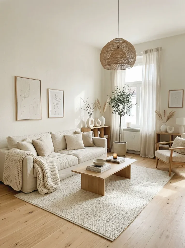
Cost: Low
Time: One weekend
Skill Level: Beginner
Best For: Small or dark living rooms
Pure white can feel stark, while a creamy white feels like soft sunlight on the wall. Pick one with a yellow or beige undertone to keep it warm. Paint a swatch beside your sofa and check it at noon and at night before you commit.
Dusty Blue
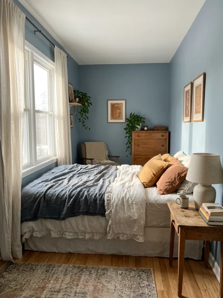
Dusty blue is the color you reach for when you want a room to feel quiet but not boring. It has a little gray in it, so it stays soft instead of icy. Morning light makes the walls glow gently, and evening lamps turn them a soft slate.
Pair it with white trim, light wood, and brass for a clean coastal feel, even far from the sea. Skip cool gray furniture, which can make the whole room feel chilly. Warm cream pillows and a striped cotton rug keep the blue feeling friendly and lived in.
Mustard Yellow Accents

- Start small with two mustard velvet pillows on a gray or cream sofa.
- Add one ochre armchair if you have the floor space. It becomes the focal point without touching your walls.
- Repeat the yellow once more, such as a vase or a throw, so the color feels planned.
- Keep the rest of the room neutral, with white walls and natural wood.
- Choose a deeper, golden mustard over a bright lemon shade, which can look sharp.
Mustard is the easiest way to add sunshine to a living room without repainting. It warms up gray and white schemes instantly, especially in winter. Stick to three yellow touches at most, spread across the room, so the eye travels instead of landing in one spot.
Chocolate Brown
Quick Tip:
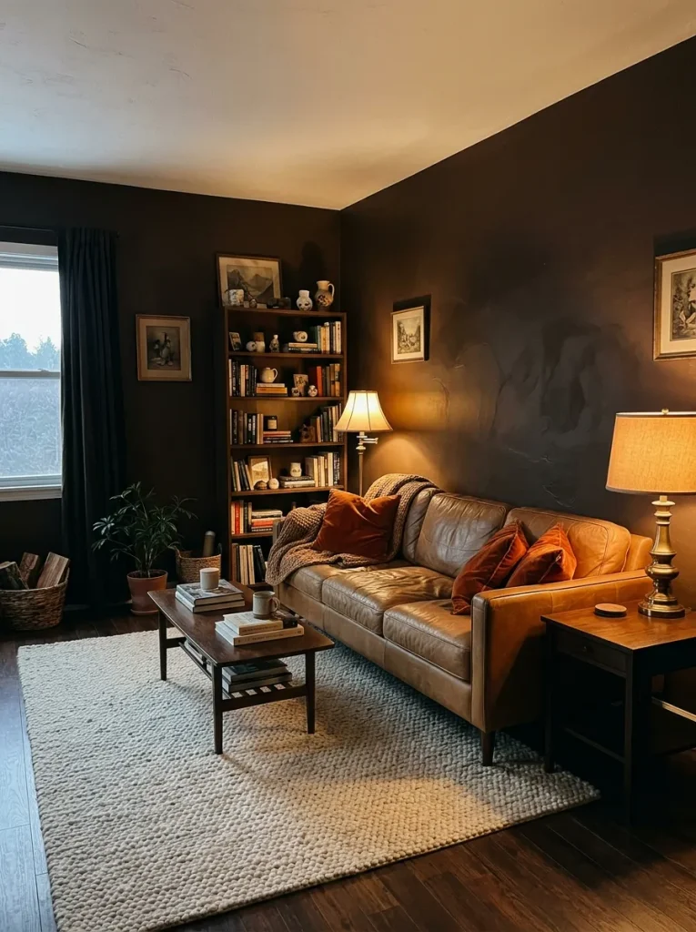
Mix chocolate brown with cream and camel so it never reads as dark. Brown works best in a living room with at least one big window, or enough lamps to fill the corners. Test it beside your flooring, because red-toned wood can clash.
Brown has quietly come back, and it feels richer than gray ever did. It wraps a room like a favorite sweater. I’ve seen it make large, echoey living rooms feel intimate. Layer cream, rust and brass so the walls glow instead of swallowing the light.
Black and White

BEFORE: A fully white room with no contrast can feel like a rental showroom. Nothing anchors the eye, so the space reads flat.
AFTER: Black window frames, a dark chair, and one bold rug give the room edges and structure. The white walls suddenly look crisper and more intentional.
Black and white is one of those living room color ideas that never feels trendy, so it never feels old. Limit black to about a quarter of the room and add wood or a green plant to soften it. Balance matters more than boldness here.
Lavender Gray
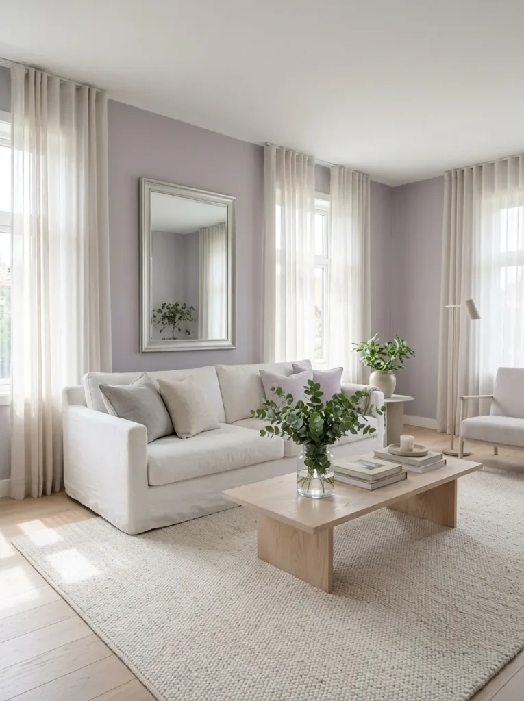
- Choose a lavender with plenty of gray in it, so it reads as a neutral and not a pastel.
- Paint a large sample near your window and look at it in morning and evening light.
- Pair it with white linen, pale wood, and silver or chrome accents.
- Add one green plant, such as eucalyptus, to keep the color grounded.
Lavender gray sounds unusual, yet it behaves like a soft neutral. It shifts from cool gray in daylight to warm mauve by lamplight, which keeps the room interesting. It suits quiet reading corners best. Keep the purple subtle, or the wall can start to feel playful.
Coastal Sand
| Point | Stark White | Warm Sand |
|---|---|---|
| Feel | Bright but cold | Soft and sun-warmed |
| Cloudy days | Looks gray | Stays cozy |
| Pairs with | Few warm tones | Blue, cream and wood |
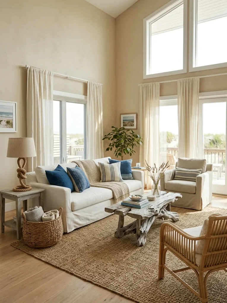
A coastal room does not need seashells or a beach. Sandy walls do the work by reflecting warmth the way dunes do. Add blue throw pillows, a seagrass rug, and white slipcovers and the whole room feels breezy and relaxed even on a gray Tuesday.
Olive and Cream

DO:
- Choose an olive with a yellow undertone so it stays warm.
- Pair it with cream, tan, and natural wood.
- Add woven textures like wicker and jute for depth.
- Use brass or aged bronze hardware for a small touch of shine.
DON’T:
- Don’t mix it with cool gray, which dulls the green.
- Don’t use stark white trim, which can look harsh against it.
- Don’t paint every wall olive in a room with little daylight.
Olive is green with a calm, settled personality. It feels earthy instead of trendy, which is why it keeps looking good year after year. Cream balances the depth and a few terracotta or rust accents add warmth without crowding the palette. That’s why many experts recommend it for busy family rooms.
Peach and Ivory
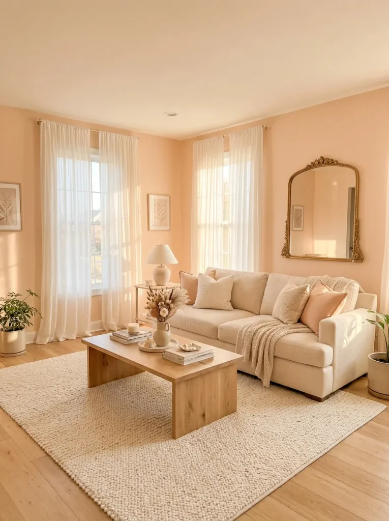
Palette: Pale peach, ivory, and gold
Mood: Warm and romantic
Works In: Rooms with low natural light
Difficulty: Easy
Peach is sunrise in paint form, and a pale version flatters every skin tone in the room. Keep it light and slightly creamy so it reads warm, not orange. Ivory trim and gold details finish the look. Check it under your own lamps before buying a gallon.
Deep Teal
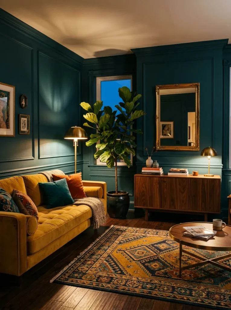
Teal sits right between blue and green, so it feels fresh and rich at the same time. In a living room, it gives wood, brass and warm metals a confident backdrop. It looks different at every hour, shifting from ocean blue at noon to deep emerald after sunset.
Balance it with a mustard or cream sofa and plenty of lamps. Teal handles clutter better than most dark colors, so it suits homes with books, art and lots of personality. Keep the ceiling white to bounce light back down. Warm bulbs help too.
Soft Taupe
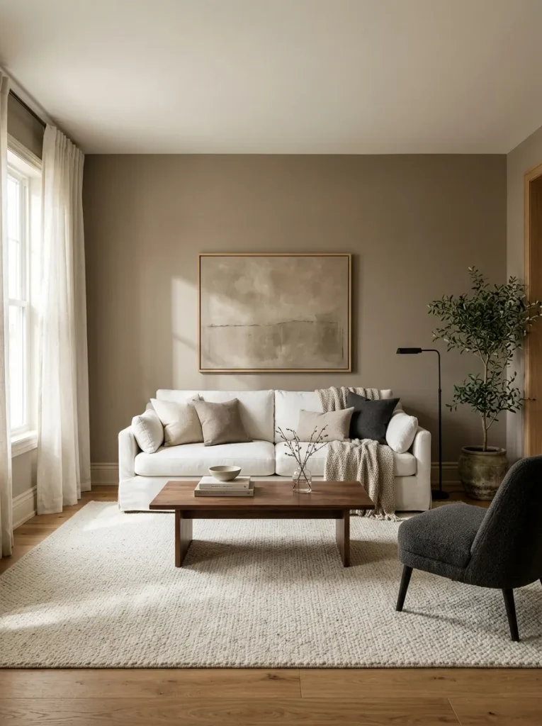
- Taupe sits between gray and brown, so it feels warmer than gray and lighter than brown.
- Pair it with white trim and a soft white ceiling to keep it from feeling dull.
- Add charcoal or black accents, such as a lamp or picture frames, for crisp definition.
- Layer in texture with a boucle pillow, a wool throw or a chunky knit blanket.
- Choose an eggshell finish if your walls have small flaws or the room gets lots of use.
Taupe is the color for people who want depth without drama. It adapts to nearly any furniture you already own, so you rarely need to replace the sofa. In my experience, it pays to check it against your floors, since taupe can pull pink next to red toned wood.
Rust and Camel
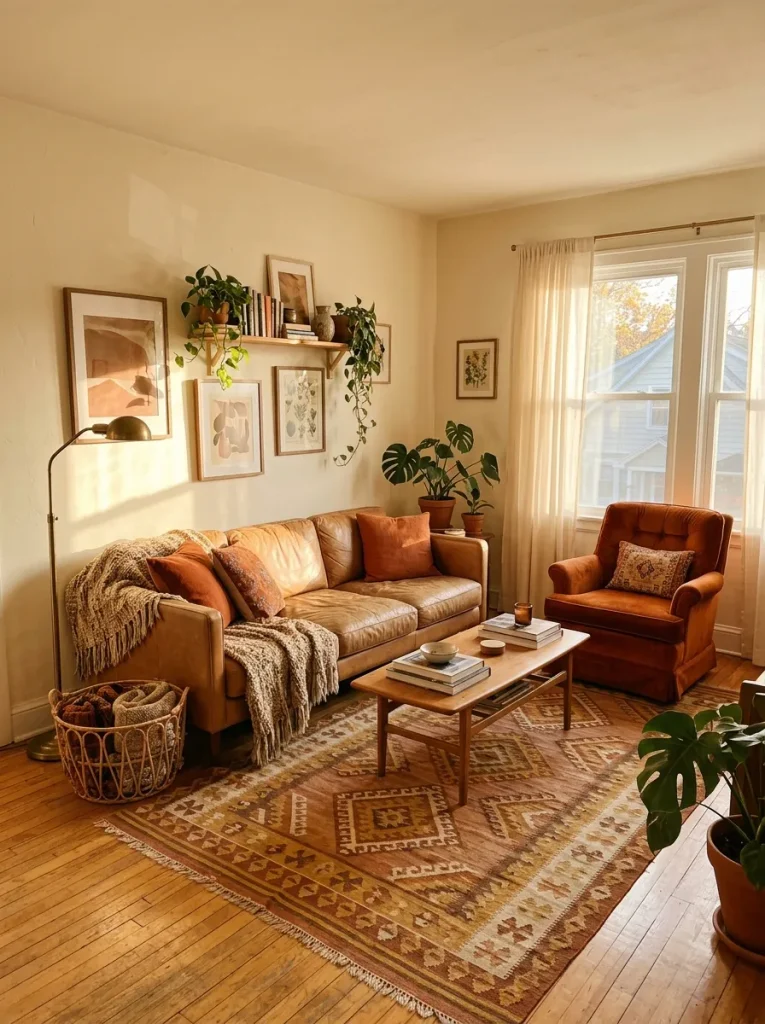
Best For: Living rooms with wood floors
Result: Cozy, earthy warmth
Cost: Low to medium
Time: One weekend
Rust and camel feel like autumn leaves and worn leather, which is exactly why they work together. Let camel be the big piece, like a sofa, and rust the accent, like a chair or pillows. Warm ivory walls keep the earth tones from getting crowded.
Pale Sky Blue

Small rooms feel bigger in pale sky blue. The color reflects daylight and recedes visually, so walls seem farther away than they really are. The effect is quiet and cheerful, like a clear spring morning, and it never feels sleepy or cold, even on cloudy days.
Choose a blue with a touch of gray so it doesn’t read like a nursery. Soft white trim, natural wood, and a few yellow accents keep it fresh. Skip high gloss paint, which can make light blue look plasticky. Matte or eggshell gives the softest finish.
Deep Burgundy
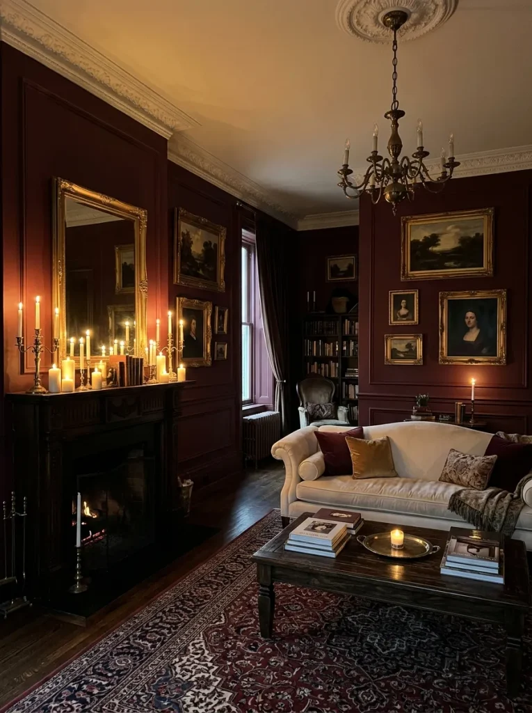
- Burgundy reads as a rich neutral when it leans brown, so look for a wine tone with warm undertones.
- Pair it with cream, gold, and dark wood for a classic, collected look.
- Use it on one wall or on built in shelving if a full room feels too bold.
- Add warm bulbs and candles, since red tones glow in low light.
- Keep the ceiling a soft white to stop the room from closing in.
Burgundy feels like a glass of red wine in the evening: warm, calm, and a bit indulgent. It works best in living rooms used for slow nights, not busy mornings. Start with pillows or a throw if you are unsure, then paint once you love the mood.
Butter Yellow
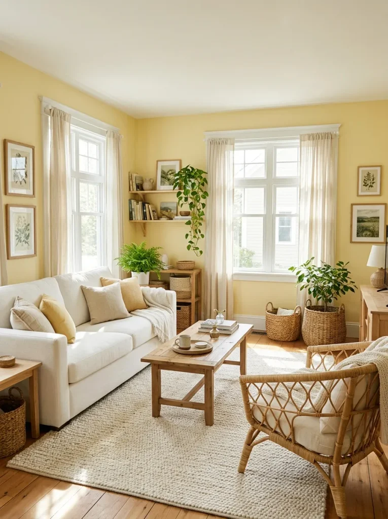
Mood: Cheerful and sunny
Pairs With: White, green, and natural wood
Works In: North-facing rooms
Skill Level: Beginner
Gray days get a lot less gloomy with butter yellow on the walls. It is softer than lemon and warmer than cream, so it fits living rooms where people actually relax all evening. Keep the sofa and floors neutral and let green plants carry the freshness.
Seafoam and White

Cool water on a hot day: that is how seafoam feels on a wall. It is lighter than sage and softer than mint, so it brightens a living room without shouting. Rooms with warm afternoon sun suit it best, since the light keeps the color fresh instead of icy.
White furniture, pale wood and woven textures keep the palette crisp. The combination calms a busy family room, because nothing in it competes for attention. Avoid cool gray accents, which can turn seafoam muddy. Warm brass or a touch of coral keeps it lively and inviting.
Monochrome Beige
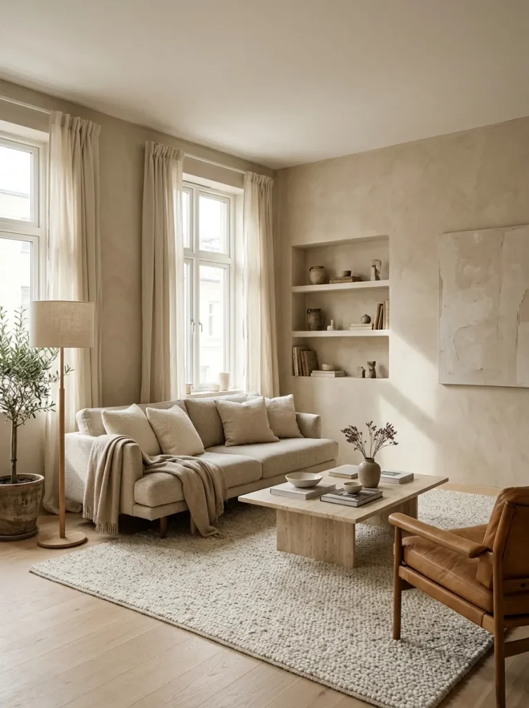
- Stay within three beige shades, from light cream to deeper tan, so the room feels layered and not flat.
- Texture does the work here. Mix boucle, linen, wool and rough stone.
- Choose one slightly darker piece, like a tan leather chair, to give the eye a place to rest.
- Add a single dark accent, such as a black lamp or frame, for definition.
- Match undertones across everything. Hold paint chips beside fabric before buying.
Beige on beige can look expensive when it is done with care. Variation is the secret: different shades, different materials, different finishes. A single bold accent, like a black vase, keeps the room from fading into the walls. Rooms like this suit people who want quiet over drama.
Emerald Jewel Tone

Cost: Medium
Time: One to two days
Best For: Statement walls and larger rooms
Result: Rich, glamorous warmth
Glamour without heaviness is hard, but emerald pulls it off. Blush, gold and cream soften its intensity, so the room feels glamorous and still welcoming. I’ve seen this work well on a single wall behind a fireplace or sofa. Pick velvet or satin upholstery to echo the richness.
Soft Dove Gray

Gray gets a bad reputation for feeling cold, yet the right dove gray feels calm and quietly polished. The trick is a warm undertone, with a hint of beige or violet in the mix. Cool, blue leaning grays are the ones that make rooms feel like offices.
Pair dove gray with white, natural oak and a soft blush or brass accent. Test it on two walls, since light changes it more than most colors. Matte paint hides imperfections and keeps the shade soft. It makes a steady backdrop for art and changing seasons.
Coral Pop Accents
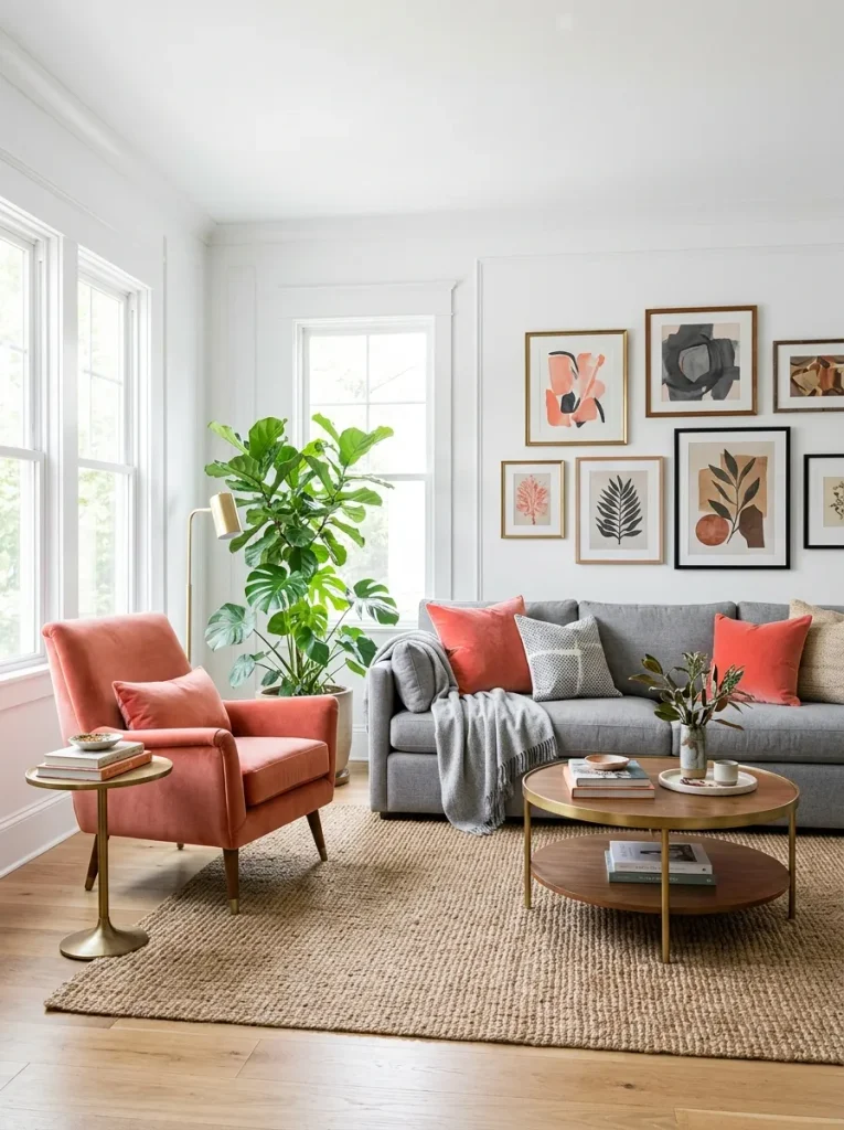
- Coral works as an accent, not a wall color, so keep the base neutral.
- Start with a single armchair or two pillows in a warm coral, not a neon shade.
- Repeat the color in a small item across the room, like a candle, vase, or art print.
- Balance it with green, since a plant or two makes coral look fresh.
- Keep metals warm, such as brass or gold, to match coral’s glow.
A little coral goes a long way. It brings energy to gray and white rooms in a way beige never could. In my experience, three pops are enough: one large, one medium, one small. That rhythm keeps the color playful and controlled. Swap them seasonally if you like.
Plum and Gold

Palette: Plum, gold and cream
Mood: Regal and warm
Works In: Evening living rooms
Difficulty: Easy to medium
Regal does not have to mean loud and plum proves it. Gold gives it a warm spark and cream keeps the room from feeling closed in. Use plum on one wall or in velvet pillows first. Add gold in small doses, such as lamps or frames, so the room stays elegant.
Warm White and Wood
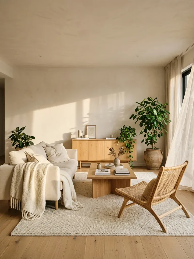
Some of the most lasting living room color ideas are the quietest ones. Warm white walls and natural wood let texture, light and greenery lead. I’ve noticed this palette ages better than almost any trend, because nothing about it depends on a season or a style.
Keep the walls a soft, creamy white and let oak, walnut or rattan carry the warmth. Add one or two green plants for life. Finish the room with linen and wool and you have a space that welcomes people in and still feels calm years from now.
CONCLUSION
The right color does more than fill a wall. It changes how a room feels at the end of a long day. With these living room color ideas, timeless simply means a palette that fits your light and your life.
I’ve seen how small changes like these can completely shift the way a space feels. Start with one sample or one pillow. Save this post on Pinterest so your favorites are easy to find, try an idea this weekend and share it with a friend who is stuck on paint. Your best room is closer than you think.



One Comment